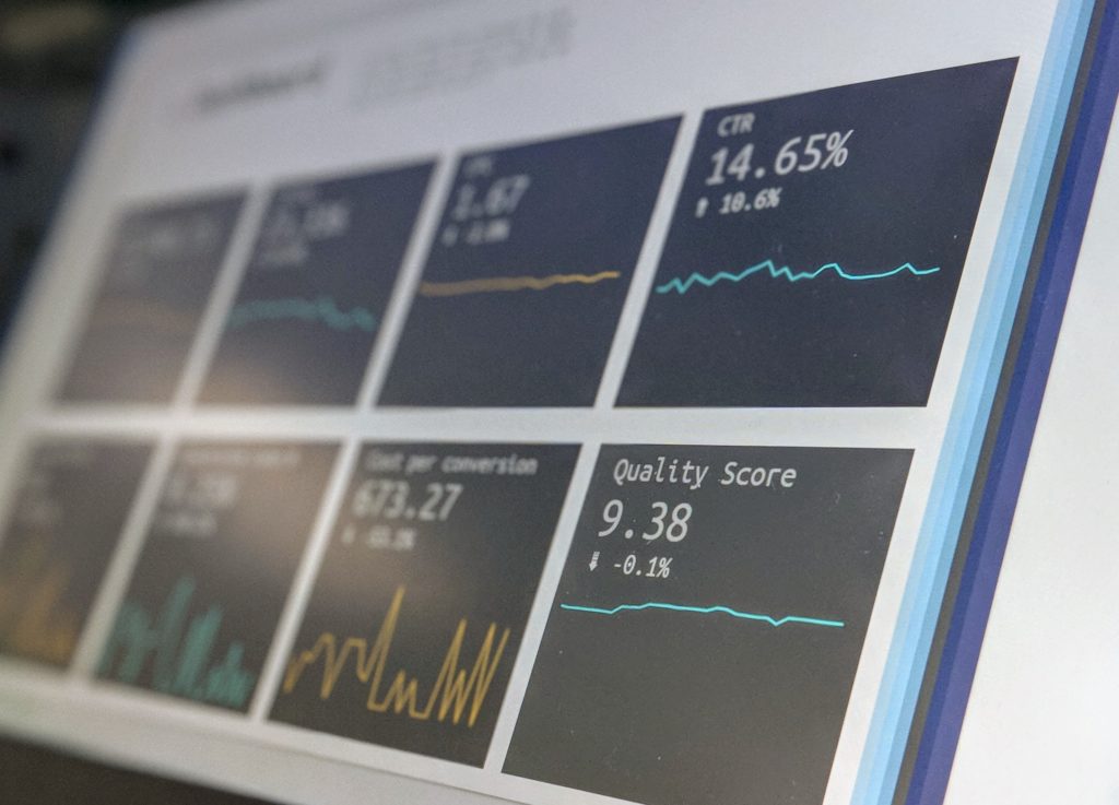
With the growing amount of data companies work with on a daily basis, it’s imperative to be able to easily and quickly sift through it all to glean business insights. Dashboard software helps in this regard, as it facilitates more informed decision-making and aligns stakeholders according to a unified business strategy.
Read more: Examining the Big Data Explosion
Best Dashboard Software
Compare Dashboard Software Vendors
Tracking | Connectors | ||||||
|---|---|---|---|---|---|---|---|
Qlik Sense
Qlik Sense is a BI and visual analytics platform designed for self-service analytics, and includes dashboard functionality. It connects with a wide range of tools, such as Azure services, data warehouses, SAP, and more.
Qlik Sense dashboards provide a fuller context to analytics in order to facilitate collaboration and ensure everyone is on the same page. Qlik Sense also enables discussion threads, user tagging, commentary, and narrative-style insights.
With this platform, users can easily share insights they discover from any mobile device. Data is also available offline, which is perfect for travelling employees, or remote workers who may experience the occasional WiFi outage.
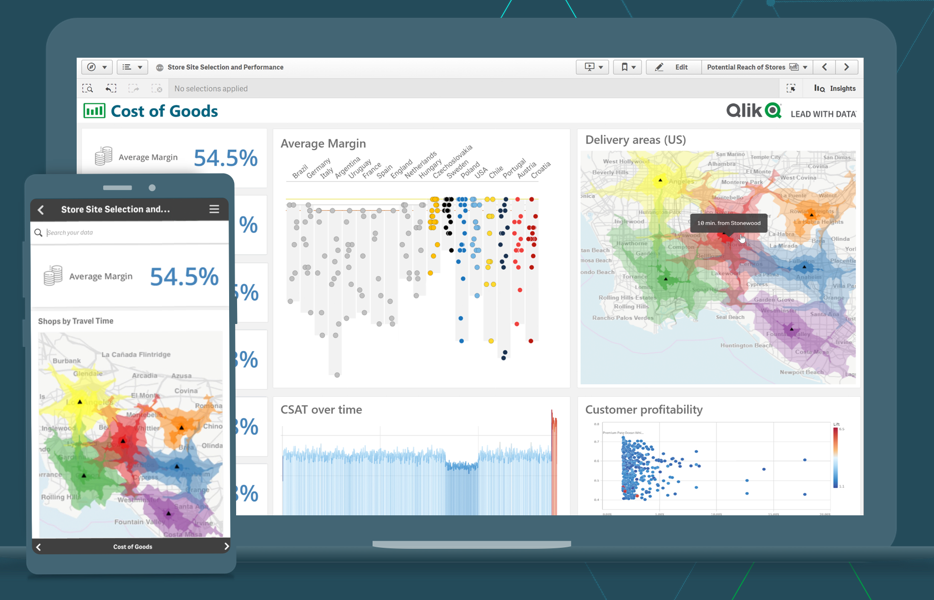
Qlik Sense’s exceptionality lies in its AI-powered functions, such as the Insight Advisor tool, NLP/NLG functions, and AutoML capabilities. Insight Advisor provides suggestions, data preparation, analytics integration, conversational interaction, and predictive analytics.
The NLP and natural language generation (NLG) functions are employed when entering a search query, or when chatting with Insight Advisor’s bot. Qlik Sense generates actionable insights and chart suggestions based on the data you combine, as well as AutoML predictions and interactive predictive calculations.
These AI-backed functions not only make Qlik Sense incredibly accessible and versatile, but also drive data-informed decisions based on future projections. This can be especially useful for sales and manufacturing teams. Further, Qlik Sense’s AI capabilities can perform repetitive tasks, freeing up BI teams to concentrate on other things.
Qlik Sense clearly has a lot to offer; users appreciate the wide range of functionality and its ability to handle large data sets from various business areas.
Domo
Domo is business intelligence (BI) software that provides a variety of dashboard customization and collaboration capabilities. Users cite the variety and ease with which Domo connects to various data sets.
In fact, Domo contains over 1,000 pre-built connectors and integrates with major CRM, ERP, and HR software. With Domo, users can see real-time data in a single dashboard that is intuitive and visually appealing, making it easier to make informed decisions with relevant information at hand.
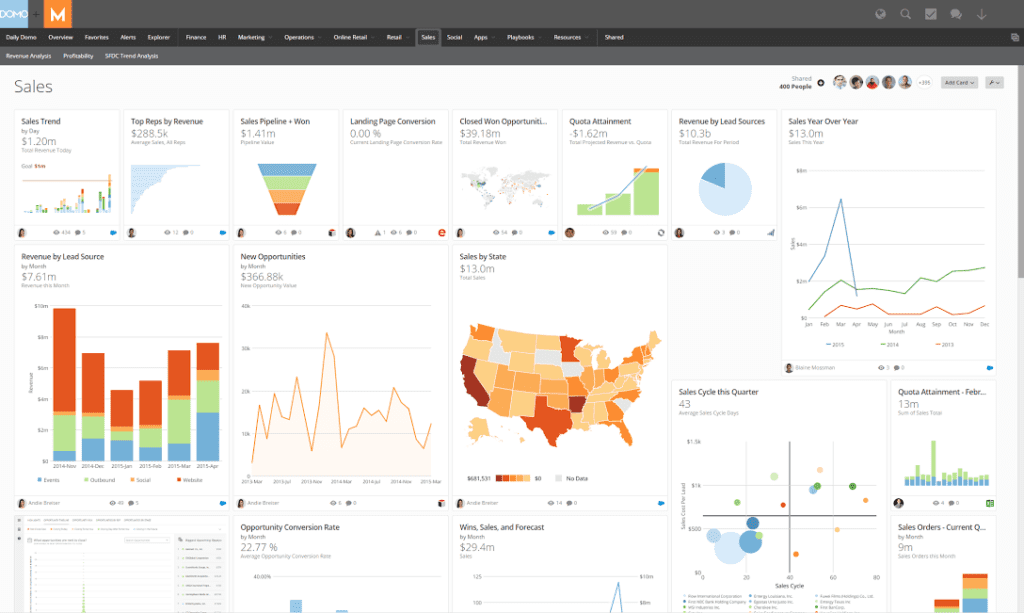
There is plenty of room for customization with Domo, as users can combine data sets with standard SQL or build their own models out of a mix of local and cloud data. Domo features 150 chart types and over 7,000 custom maps to get you started. It also has a storytelling tool that presents quantitative data in narrative form.
Domo also facilitates cross-functional collaboration and self-serve data access. Employees from different areas of the company can access and comment on shared information. Users can send personal messages from the Domo Buzz tool, and receive update notifications regarding parts of the dashboard software that are most relevant to their team or department. Domo also has governance tools that limit access and permission for certain users.
Dundas BI
Dundas BI is an enterprise business intelligence platform equipped with tools that help you build and engage with interactive dashboards. It allows for customization of dashboards by adding the visuals that you want, such as heat maps or color scale legends, and arranging them in a way that’s most intuitive to you.
Whether you want high-level or deep insights, Dundas BI’s dashboards allow you to filter, group, organize, drill down, and perform advanced calculations in a user-friendly interface. If you don’t want to build a dashboard from scratch, Dundas BI has plenty of templates to start with.
Dundas BI’s dashboard software uses natural language processing (NLP), which works in conjunction with the virtual assistant. This allows you to build metrics and explore data with your voice, kind of like asking your at-home smart speaker a question.
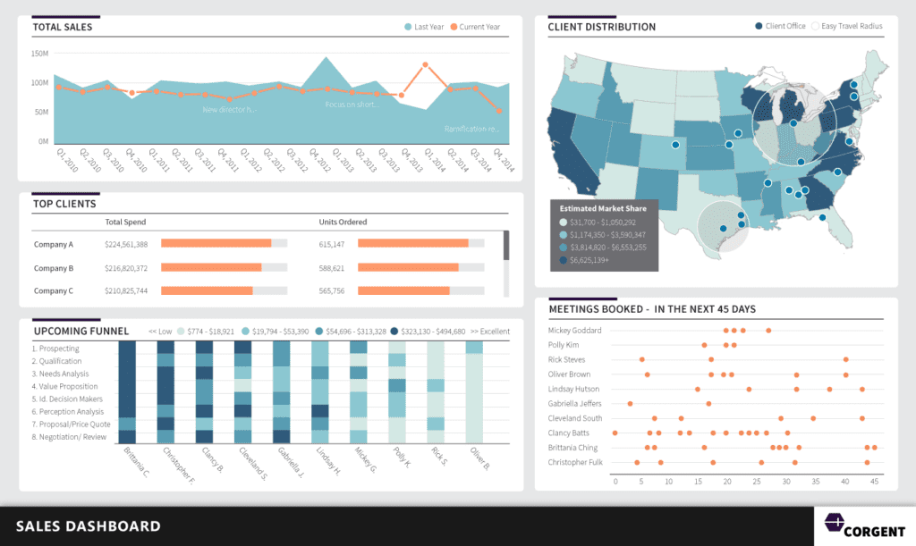
You can access your dashboards on the go, as Dundas BI’s dashboards are web-based and mobile optimized. You can also share dashboards with your team members, enabling collaboration in your HTML5 browser of choice. Users can annotate the metrics directly, post comments, and respond to others’ feedback.
Dundas BI’s slideshow tool allows you to present data in real-time and follows a slidedeck progression that tells a story about the data.
Further, Dundas BI is highly customizable and extensible. It features a variety of dashboard properties, scripting options, and an open API — though users have reported that Dundas BI could improve its documentation for some of its API integrations. It’s compatible with the Microsoft BI stack and connects with many Azure services. It can also integrate with Client Portals, your CRM system, or your Intranet.
Overall, user reviews dislike the high learning curve of this platform. However, they’re happy with the large data sets that Dundas BI is capable of handling.
GoodData
GoodData is a BI platform that features customizable as well as out-of-the-box dashboards. Based on the type of data worked with, GoodData provides recommendations of what type of visualization to use. Dashboards are sharable to any device that connects to the internet, but GoodData doesn’t have the collaboration tools that other vendors do.
GoodData integrates with a variety of data sources, such as cloud data warehouses like BigQuery, Redshift, or Snowflake, as well as storage services or other systems with pre-built connectors. Otherwise, users upload their data as a CSV file.
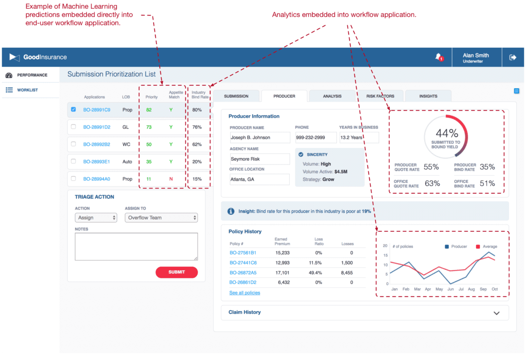
GoodData affords visibility on KPIs to both internal and external stakeholders by allowing data to be shared with clients — who can then customize their own dashboards. With data sharing comes security risk, however. To mitigate sensitive data from getting into the wrong hands, GoodData offers governance measures through its Security Shield and Enterprise Shield tools, ensuring data security and access control.
Finally, GoodData uses machine learning predictive analytics that embed directly into workflows, which could be beneficial to sales and production teams.
HubSpot
HubSpot is a CRM platform that focuses primarily on sales and marketing functions. It’s therefore great for contact syncing, connecting with other CRM systems, and tracking sales and marketing KPIs.
Within its dashboard and reporting functions, users can create up to 300 different dashboards. To help you get started, HubSpot features a dashboard template library for marketing, sales, and service verticals.
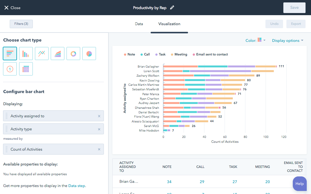
HubSpot generates dashboards from its marketing, sales, and service data, as well as integrated data from other apps. Though HubSpot integrates with many major apps, such as Microsoft365, Salesforce, and Mailchimp, users note that some integrations require a high-level subscription.
HubSpot’s dashboards are collaborative to the extent that they are sharable. However, there is no annotation functionality. Importantly, HubSpot allows users to keep dashboards private, make them public, or restrict access to specific people or teams within the organization.
iDashboards
iDashboards is a comprehensive BI solution, part of which is the versatile and easy-to-use dashboard creation function. iDashboards’ draws from multiple data sources, such as Excel, Quickbooks, Salesforce, SQL, and many more.
iDashboards has a library of more than 200 dashboard templates. On its website, it features interactive dashboard examples for a variety of use cases, so you can get a good idea of how their dashboards look, feel, and operate before reaching out to one of their representatives.
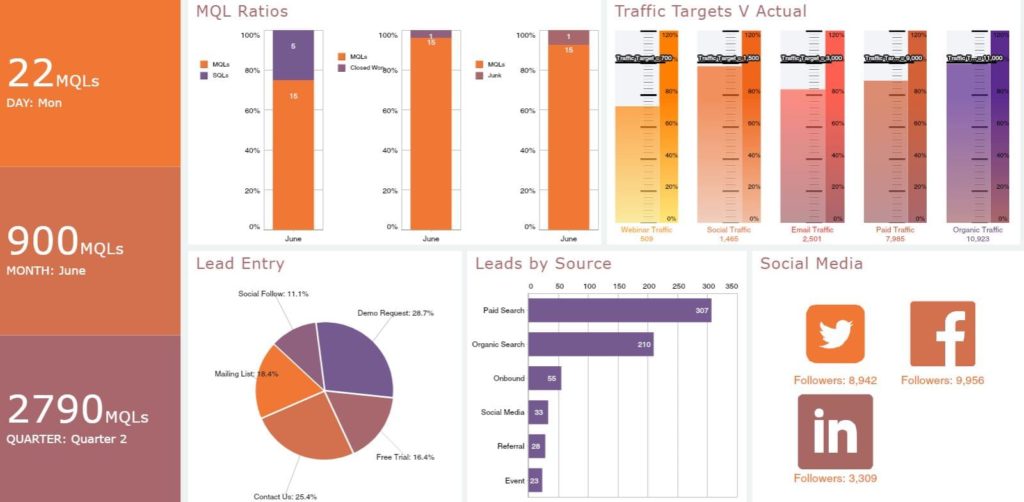
iDashboards also leaves room for customization to fit your unique needs. Once you create your dashboard, it’s easy to share, and authorized users can access it on mobile or desktop. Conversely, iDashboards lacks the collaborative annotation tools of other solutions.
Looker
Looker is a cloud-based BI platform designed for data exploration and analysis. Looker helps your business capture and analyze data from multiple sources, including SQL.
With Looker’s dashboards function, you can create customizable charts, graphs, and reports that best fit a particular team/role. However, reviews mention the limited templates available and the lack of suggestions for the best data visualization format — so the user experience might take some time to get accustomed to.
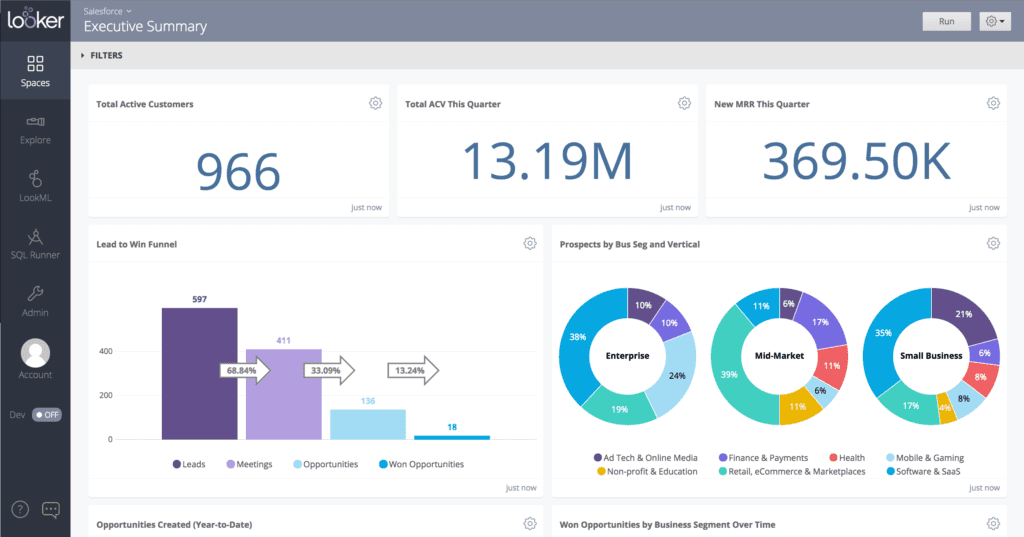
Users can also discover information in multiple layers by drilling into dashboards and queries. When it comes time to share findings, the storytelling feature presents data analysis through data-rich visualizations.
Its unique modeling language assists in real-time data analysis and in viewing relationships between different data sets. Looker integrates data into daily workflows and allows for self-service data discovery, whether sifting through large datasets or diving into a drill-down view.
Given the lack of templates, Looker is a good option if you’re looking for dashboard software that technically savvy data analysts will be using.
Sisense
Sisense is end-to-end business analytics software that includes a variety of dashboard types and features. Sisense dashboards are powered by cloud or on-premise data through a variety of data connectors that are compatible with GitHub, Oracle, and many other data repositories.
Sisense allows users to create different types of dashboards, according to industry, business goals, or role. It provides plenty of widgets and templates to choose from, which you can then customize to fit your particular business needs.
Once you create your dashboard, you can integrate it into everyday applications and workflows, making business intelligence easy to access. Sisense enables cross-team collaboration through report access, common-view monitoring, and sharing; you can do this all on the go, as Sisense’s solutions are mobile optimized.
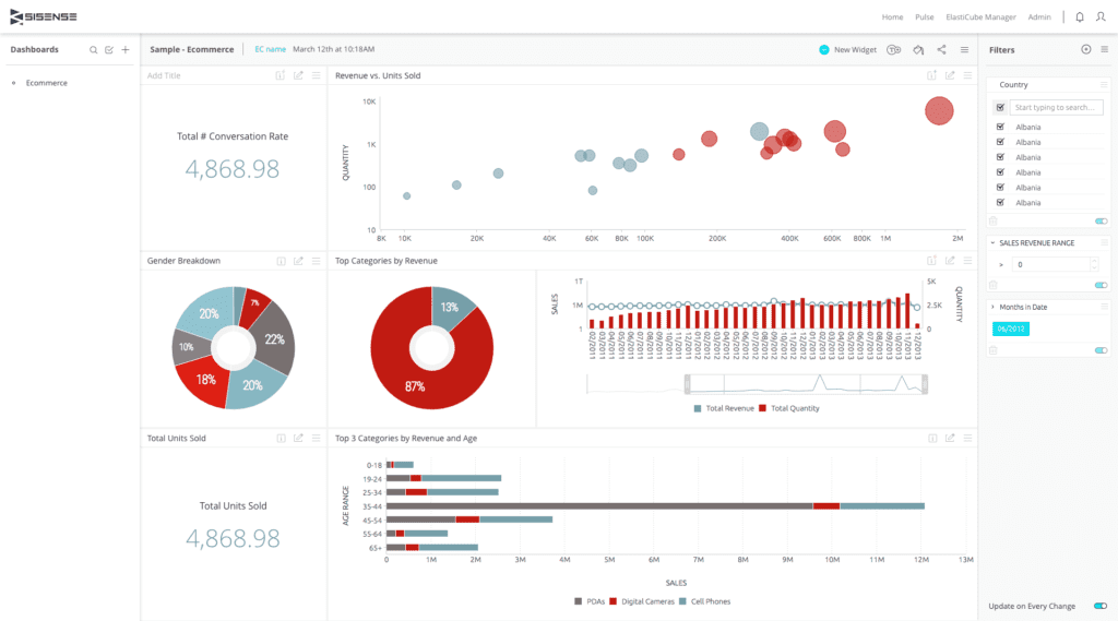
The Sisense BloX tool facilitates simple creation of data-driven applications with the variety of templates available. The apps that you create can then be integrated into your Sisense dashboards to give them app-like functionality, and thus an enhanced user experience.
Sisense’s AI-backed tools accelerate the process between data prep and insight generation. Furthermore, it makes data analysis accessible to all users, regardless of their role or level of analytical expertise.
The AI-based technology generates insights according to user input, guiding users down a path of data exploration. For the more technically savvy users, Sisense allows for the creation of custom models using SQL, Python, and R.
In spite of AI-backed tools that are meant to make Sisense more user friendly, making full use of the software does require overcoming a high learning curve for non-technical users. Reviews frequently note that the interface is somewhat difficult to work with.
Tableau
Tableau is an integrated business intelligence and analytics solution that collects data from multiple sources, including SQL and Salesforce, in order to produce business insights. It features live visual analytics and interactive dashboards. Users can create interactive maps or a narrative story from data through drag-and-drop or natural language input.
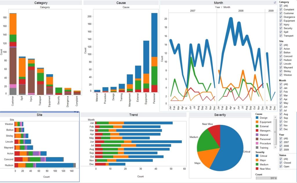
Tableau offers three main products that analyze big data: Tableau Desktop, Tableau Server, and Tableau Online. The one that is right for you will largely depend on who is using the software.
- Tableau Desktop is geared toward individual analysts who want to get in the weeds of data. It allows users to create interactive dashboards with drag-and-drop features to develop data visualizations from large data sets.
- Tableau Server is a browser-based analytics application that provides all of the big data advantages of Tableau Desktop, but is specifically designed for varying levels of granularity. Tableau Server supports and secures large data sets and is designed for enterprise-wide use. If users across your organization need to be able to access and configure data into graphs, charts, and more, Tableau Server is a good choice.
- Tableau Online is the hosted version of Tableau Server, providing maximum security so businesses can confidently share data. It provides Dashboard Starters (templates) that you can then customize to your liking. Made for users working in a variety of capacities, Tableau online is user-friendly and allows information to be shared widely and securely. This is a great option if only some units of the company, such as sales and finance, need to be able to sift through and present data.
Tableau Desktop and Tableau Server feature the Ask Data tool, which uses natural language processing to answer user questions visually. Ask Data uses algorithms to automatically profile, index, and optimize data sources.
Given the three options, you’re likely to find one that fits your business needs based on the number of users, and what those users need out of the dashboard software.
Read more at TechnologyAdvice: Qlik vs Tableau: BI Software Comparison
Zoho Analytics
Zoho Analytics is a cloud-based, self-service business intelligence and analytics solution that assists with analyzing business data and creating insightful dashboards for informed decision-making. It draws data from multiple sources, such as files and databases.
Zoho Analytics allows users to filter and analyze data flexibly using visualization tools that are built into the platform. It provides various charts, widgets, pivot tables, tabular view components, and more visualizations to create your own reports and dashboards. User reviews like its range of functionality and user-friendly interface.
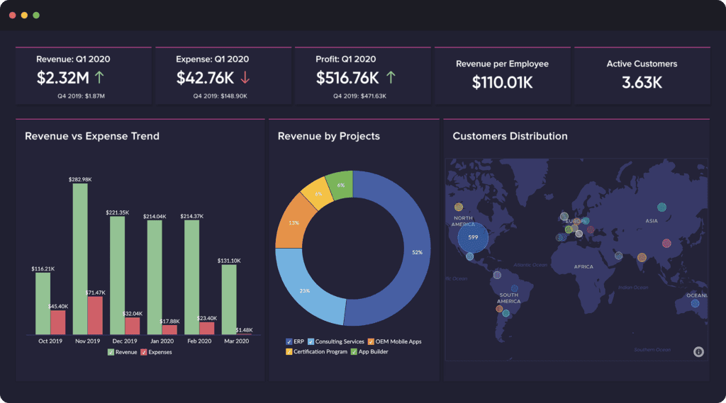
Users can combine and arrange multiple reports into tabbed dashboards and insert rich narratives in the form of images, formatted text, widgets, and web components in a flexible designer layout. For the more analytical users, dashboards in Zoho Analytics allow for deeper interaction with visuals by viewing the data behind them, drilling down, and applying filters.
Zoho Analytics features three types of dashboards:
- Business: The Business dashboard allows you to easily create and share dashboards with the drag-and-drop dashboard creator. This type of dashboard has the broadest use. It’s best suited to those who have little or no technical expertise.
- Executive: The Executive dashboard serves data on high-level performance indicators for sales, marketing, finance, and customer service, all brought together on a single page.
- KPI: The KPI dashboard lets users hone in on specific KPIs for a business area. Given the focused attention on particular KPIs, this dashboard would likely best serve mid-level management and data analysts for a particular area of the business.
The three different options that Zoho Analytics offers are largely role-based, and are not necessarily mutually exclusive. Notably, the Business and KPI dashboards overlap in their features and seem to draw from the same data sources.
Factors to Consider When Choosing Dashboard Software
SQL compatibility
Not all solutions make use of Structured Query Language (SQL) for data pulls. If you use a SQL database, be sure to turn to a solution such as Domo, iDashboard, Looker, Sisense, or Tableau, that is compatible with it.
Customization
Though out-of-the box templates will likely be helpful, the dashboard software of choice should support customization, such as end-user configurations, cascading style sheets (CSS), and full scripting to match the needs of your industry and business.
Data Visualization
Be sure the dashboard tool you choose includes a variety of visualization formats, beyond the standard charts and graphs. You may, for example, need geographical maps, heat maps, or color scale legends, depending on your business needs.
Another point to consider is the ease with which you can present these visualizations to others. Some dashboard software, such as Dundas BI and Looker, specifically offer presentational modes.
Mobility
Mobile functionality allows users to view, analyze, and interact with data on the go wherever they are. Depending on the nature of your business and your workforce, a mobile-optimized dashboard software solution might be nice to have or even a must-have.
For example, if many of your employees travel (i.e., sales) and/or work remotely, then a mobile, device-agnostic dashboard software solution will likely be a must.
Types of Dashboard Software
There are three main types of dashboard software. Assessing which type you need is a great place to start.
Analytical
Analytical dashboard software is primarily of use to data analysts; it’s used to predict future trends based on historical data. This type of dashboard software, therefore, doesn’t always show real-time data, but is particularly useful for things like sales or production forecasting.
Operational
Operational dashboard software shows real-time data on the business’s core operations. Offering a bird’s-eye view, this type of software provides a snapshot of the company’s current operational performance. Mid-level management, plant managers, and other on-premises staff are the most likely stakeholders to avail themselves of the data in this type of dashboard software.
Strategic
Strategic dashboard software affords a broad overview of company performance, showing data on a range of KPIs from various departments. This type of dashboard software is for long-term tracking, and therefore doesn’t necessarily show real-time updates.
It’s mostly used by C-level management to see how the various parts of the business are working together in alignment with broader business goals and strategies.
Read more: Top Business Intelligence Trends for 2021
Benefits of Dashboard Software
Dashboard software enables quicker, more informed decision-making by gathering information on KPIs from a variety of sources and serving it up in a simplified way. Further, good dashboard software will be accessible to various stakeholders, allowing them to view the data in charts, graphs, and other visual formats.
When the dashboard presents a comprehensive overview, stakeholders are more likely to be on the same page. They not only have the most relevant intel for their role, but also company-wide data.
Choosing the Right Dashboard Software
There are several options covered here, all of which offer the standard features of customization, integration, data connectors, and KPI monitoring. Some go above and beyond by offering additional features, like mobile interactivity and AI-powered tools; these may or may not fit your current business needs.
So before you make the financial investment in all-encompassing dashboard software, first decide who will use the dashboard software and how they will use it.
Read next: Top Big Data Tools & Software for 2022